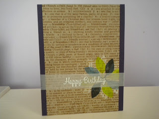
His/Her Card Clas Day 3 Card 2
I stamped the wheat in black and added an argyle border in purple. I add the sentiment and then mounted this on a purple mat. I thought it was busy enough so I didn't add the splashes of color I thought I would.
Thursday, May 2, 2013
His/Her Cards Day 3 Card 1
His/Her Cards Day 3 Card 1
I used colored pencils and a colorless blender on the flowers and butterflies. I used Distress Inks and water for the splastters. Then I added the sentiment and mounted on a purple mat.
I used colored pencils and a colorless blender on the flowers and butterflies. I used Distress Inks and water for the splastters. Then I added the sentiment and mounted on a purple mat.
His/Her Cards Day 2 Card 2
His/ Her Cards Day 2 Card 2
The right inks and colors make all the difference with this method. I really enjoyed trying this out. Like how the masculine feel is there. This class is helping me a great deal to see how to change up a few things to make a card masculine.
Next time I would use a secondary stamping of the bkgd stamp in order to have it not so bright. I would also stop the vellum at the edge of the kraft paper instead of going all the way out over the purple mat.
His/Her Day 2 Card 1
His/Her Day 2 Card 1
I tried the technique Jennifer did....not as easy as she makes it look. Definitely the type of ink you use makes a huge difference. I got ink on the side of the front by mistake so I cut it down and mounted it on the purple mat. I sprayed the vellum with glue and attached directly to the front.
I tried the technique Jennifer did....not as easy as she makes it look. Definitely the type of ink you use makes a huge difference. I got ink on the side of the front by mistake so I cut it down and mounted it on the purple mat. I sprayed the vellum with glue and attached directly to the front.
Monday, April 29, 2013
His/Hers Day 1 Card 4
His/Her Cards Day 1 Card 4
This is my femine card to match Card 3 masculine version. I used Smooches to color in the hummingbird so it would glow some.
This is my femine card to match Card 3 masculine version. I used Smooches to color in the hummingbird so it would glow some.
His/Her Card Day 1 Card 3
His/Her Card Day 1 Card 3
I started out looking at Kristina's sketch, but ended up here for the masculine card. Now I am planning to change this and make it a feminime card following this layout.
I started out looking at Kristina's sketch, but ended up here for the masculine card. Now I am planning to change this and make it a feminime card following this layout.
His/Her Class Day 1 Card 2
His/Her Card Class Day 1 Card 2
I tried the technique Jennifer used for her masculine card. I used different colors. I started out with white pigment ink and used green dye ink over and off center from the original. I used a more rigid font for the sentiment and mounted it on a white base, after I used my T ruler and a green marker to make the line across the front.
I tried the technique Jennifer used for her masculine card. I used different colors. I started out with white pigment ink and used green dye ink over and off center from the original. I used a more rigid font for the sentiment and mounted it on a white base, after I used my T ruler and a green marker to make the line across the front.
Subscribe to:
Posts (Atom)


